
Airbnb – Rewards
Duration: 3 weeks | Bootcamp Project
Tools: Figma | Illustrator
Team: Zoe Gage | Matthew Rumancik | Sophia Kim
Context
With Airbnb’s mission of community and belonging in mind, we identified an opportunity to reduce high booking fees and enhance the user experience through loyalty rewards and benefits.
Challenge
Individuals who do not regularly choose Airbnb need to be rewarded for their bookings to incentivize continued use and attract new users.
Understanding Our Competition
-
Started in 2008 as Airbed & Breakfast
Became “Airbnb” in March 2009
Became profitable in 2016
Went public on the NYSE December 2020
Over 4 million hosts and 2 million guests per day
Only 8,611 employees
-
The oldest hotel was built in 705 AD (Japan)
Luxury hotels launched and expanded in the 1800’s
Now, there are over 700,000 hotels globally with over 15.5 million rooms.
Marriott International is the largest global chain with 30 brands and over 14,000 rooms
Over 160 million Marriott BonVoy members.
User Research
To gain a deeper understanding of reward programs and Airbnb users, we interviewed participants in reward benefits and collected the results
-
Reward Benefits
What benefits and rewards programs are you a part of?
How long have you been using that program?
What stands out the most to you in terms of rewards programs?
How are you rewarded for your usage? Do you feel adequately rewarded?
Have you seen that program evolve over the years?
What have you liked or not liked about the changes they have made?
What do you like about the current program interface/program options when you are logged in?
What are the biggest areas of opportunity (what would you change) about the current program?
You are looking to book a vacation and need a place to stay, can you talk me through the steps you take to achieve this?
Airbnb Experience
Tell me about your last experience using the Airbnb website/app.
What made you choose Airbnb over a hotel? What led to that choice? Why?
In what situation(s) would you opt for a hotel over an Airbnb?
What do you like most about using the Airbnb website/app?
What would you change about the Airbnb website/app if you could change it?
Walk me through your typical process for narrowing down your search.
Tell me about your experience with the booking/check-out process at Airbnb? Any frustrations or pain points? Any delights?
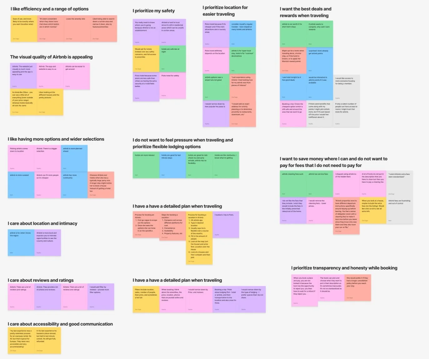
Card Sorting - Reward Program Users
Users prefer a simple point system with tiers, avoiding games or extra redeeming options.
Users look for ease in “redeeming points”
Users prioritize saving money & eliminating extra fees using their rewards

Card Sorting - Airbnb Users
Users prefer Airbnb due to location/flexibility and party size.
Users prefer Hotels due to lower costs, security, and booking rewards.
Who Are Our Users?
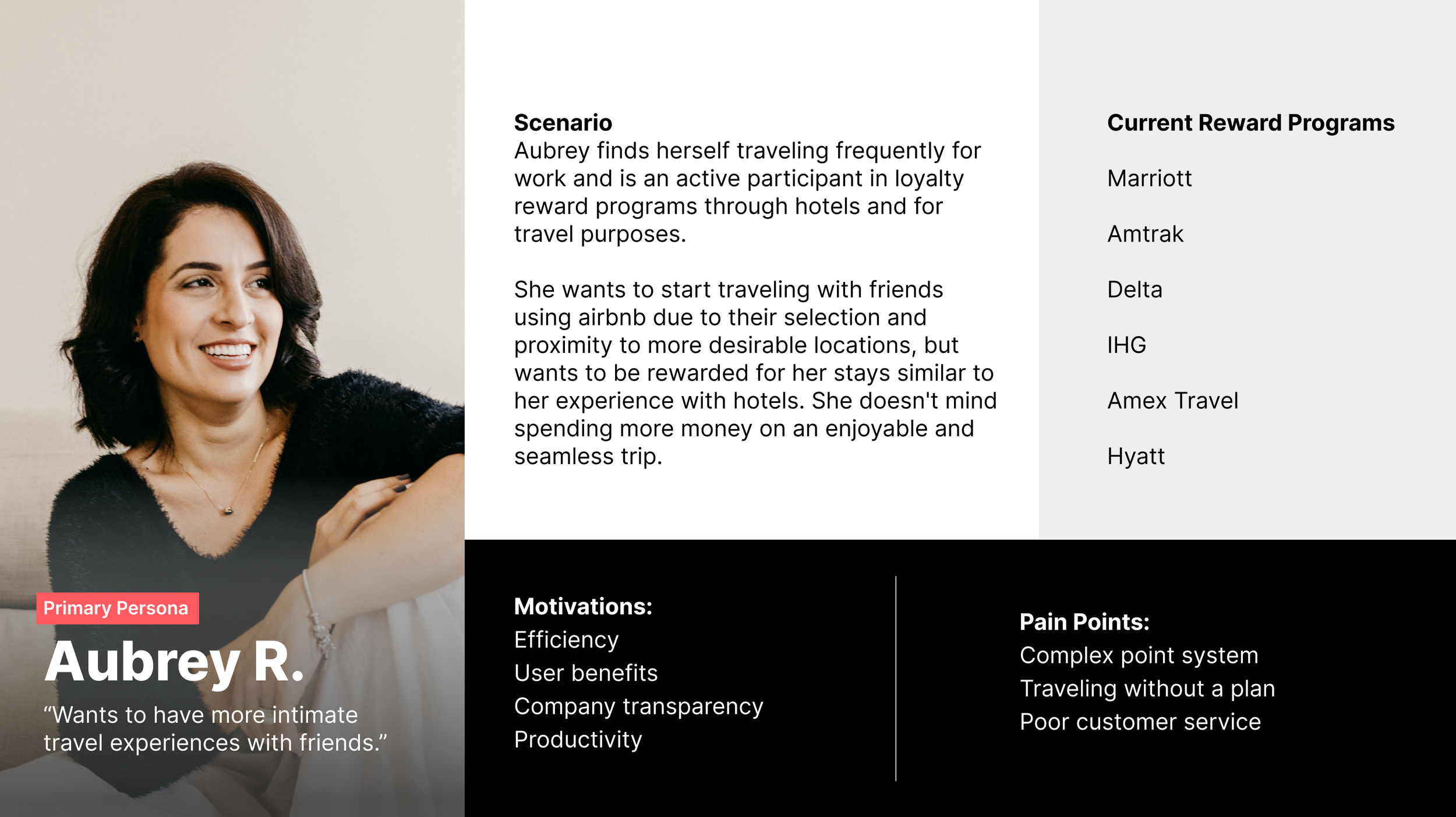
Primary: Hotel guests need rewards for booking through Airbnb to increase the likelihood of choosing Airbnb over hotels.
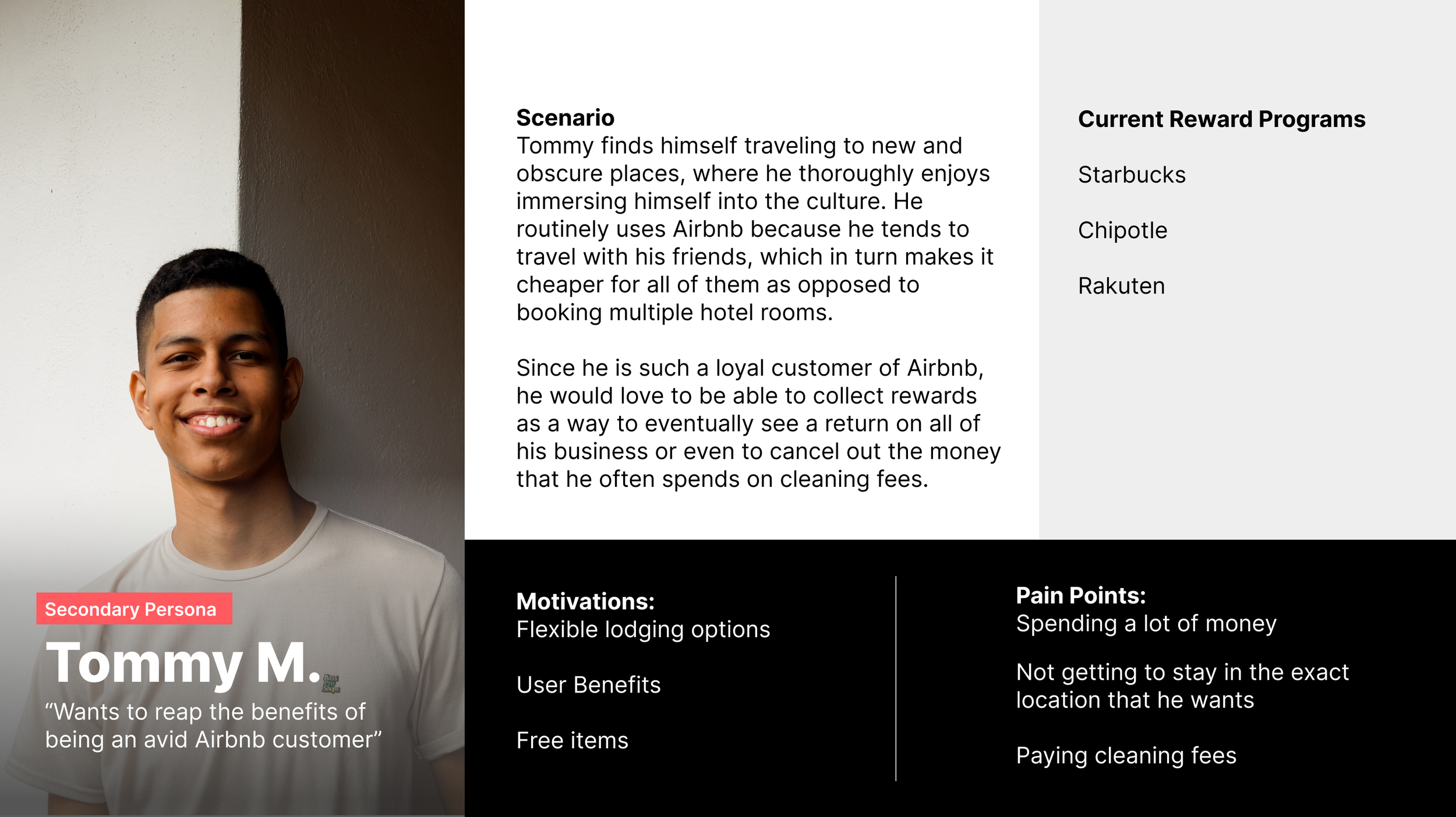
Secondary: Frequent Airbnb users need rewards to encourage loyalty despite high booking rates and fees.
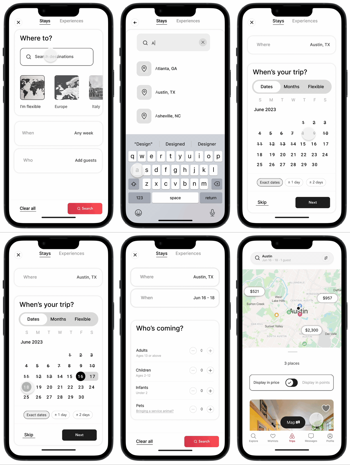
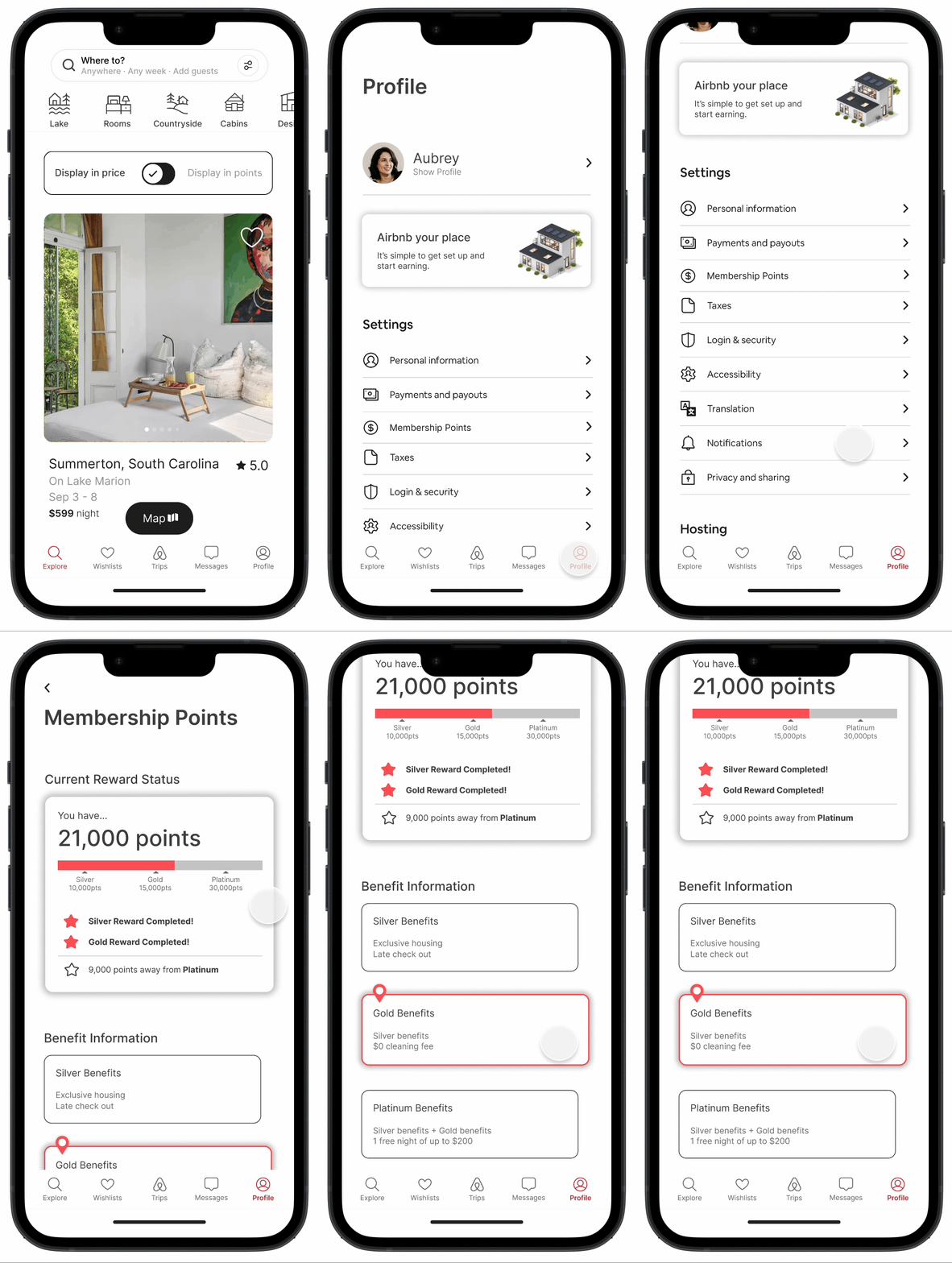
What is the ideal path towards efficient booking, and reward usage?
Identifying users points status/balance
Exploring lodging options through a points system.
Booking a stay using your points


Designing Solutions
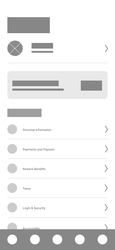
Designing mid-fidelity wireframes highlighted some flows that were less intuitive than expected. Through a detailed review, we pinpointed areas that could cause user confusion, made adjustments to simplify navigation, and improved overall usability.



Testing Our Solutions
Upon creating our prototype, we performed 7 usability tests. 6 out of participants completed our tasks successfully, however we identified areas of improvements and made iterations to our designs.
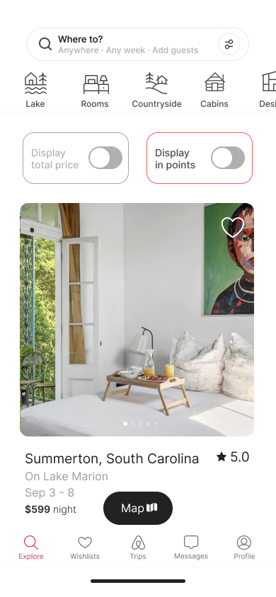
Viewing In Points
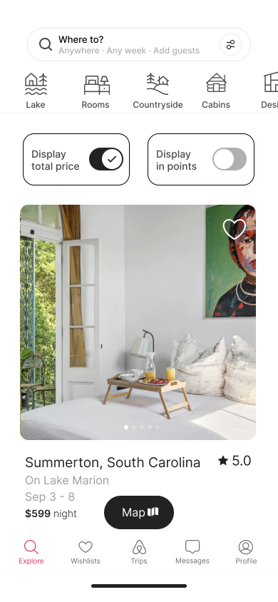
User Challenge: The ‘Display in points’ widgets was mistaken for a design error.
Iteration: We adjusted the outline stroke to match the “Display in price”, creating a more cohesive design.
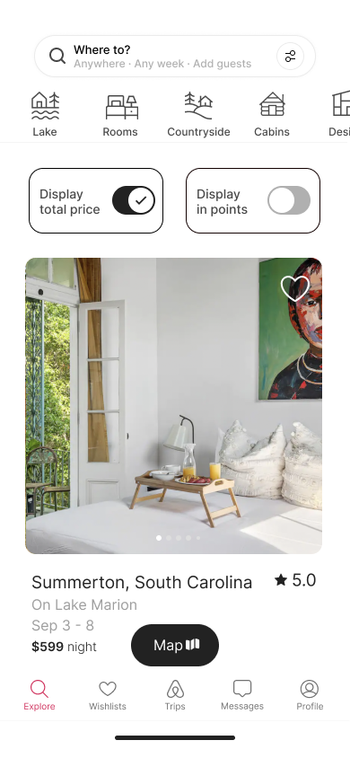
Toggle Inconsistencies
User Challenge: “Display in price” toggle automatically turned off even when users had not interacted with it.
Created a singular toggle to represent “Display in price” and “Display in points”.

Checkout In Points
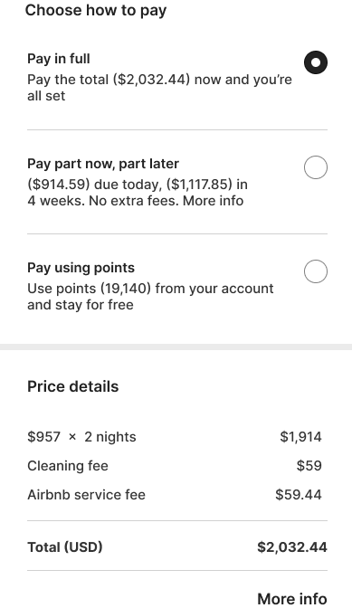
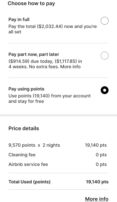
Challenge: Instructions were provided for paying with points, but users overlooked the defaulted "pay in full" radio button since it had been pre-selected at checkout.
Iteration: We changed the default payment setting to align with the user's viewing method from the home screen.
Point Balance Visibility
Challenge: Users wanted to easily access their point balance without flipping through multiple screens.
Iteration: We noticed that the second line of text in Airbnb’s search field was redundant since 100% of our users knew to click into this, so we replaced trip information with users remaining points.


Next Steps
Dive deeper into Airbnb’s business model to identify the most effective tier system, balancing both user experience and financial viability.
Enhance the user experience by introducing a feature that unlocks exclusive lodging options once the user reaches the appropriate tier level.
Redesign the landing page to accommodate new features based on the user's reward tier level.